DACF Home → Bureaus & Programs → Maine Geological Survey → Using Geologic Maps → Becoming an Informed Map Reader
Reading Maps with a Critical Eye: Becoming an Informed Map Reader
A colored geologic map printed on a large-format inkjet printer takes on an aura of authority. Most people who look at a printed map assume it's "right." As an informed map reader, however, you must remember that a geologic map is a representation of an area's geology. Geologic maps are partly objective data and partly subjective interpretation; they are in part the opinion of the geologist. Supported by facts and data, yes, but an opinion nonetheless. As such, this opinion or interpretation may change with the acquisition of new data over time. To understand this concept is to be well on the way to intelligent map use. A geologic map must be read as an interpretation of geologic observations at a certain point in time. So how can you gauge the accuracy and reliability of a geologic map? Start by considering the following questions.
Publication Basics
What type of publication is it?
Is the map a progess map, an open-file map, or a published map?
- Progress maps are preliminary maps constructed after only a short time in the field. As a result, progress maps may contain areas with no information, and the geologic contacts are often very uncertain. The basic observations on the maps are reliable, but the interpretations are based on limited data with little or no peer review by other geologists. If they are prepared and published, they are done so to make this basic data available to other geologists. These maps are identified by the words "Progress Map" next to the publication number in the title block.
- Open-file maps represent a more extensive gathering of data which allows the geologist to be more precise in the location of boundaries and the interpretation of geologic structure. They have undergone some peer review by other geologists. These maps may be continually updated as new information is gathered. They are recognized by the open-file number in the title block. Most maps produced by the Maine Geological Survey fall into this category.
- Published maps usually represent years of work in an area with a high level of detail and supporting data. They undergo extensive "peer review" by other geologists who evaluate and approve the author's interpretation.
When was it published?
Geologic mapping is an ongoing process. Over time, new data is often added to the store of information collected for a certain area. The addition of this new data may cause geologic units to be reclassified, renamed, grouped, or split, and may produce a new interpretation, resulting in a new map pattern. The open-file system was developed to allow for maps to be easily revised and updated, showing the most recent interpretations. It's possible for new open-file information to be more accurate than older published maps. So make sure you have the most up-to-date information available.
Have you gathered any associated maps and reports?
An accompanying report may give details such as how long the author worked in the area, sections of the map in which interpretation was difficult, or areas lacking reliable outcrop information. The report may also list other sources in a "Previous Work" section or the bibliography. Consulting these other sources may give an indication of previous interpretations in the area, or what information the map was based on. The text itself may be rather difficult to understand, especially if it is a technical report. However, it is often worthwhile to wade through the report to gather extra information.
Also be aware of the information shown on related maps. Surficial materials maps show the data points used to construct surficial geology maps. Surficial geology maps aid in the development of significant aquifer maps and coastal landslide hazards maps. So, for the total picture, investigate the interrelationship of the various maps.
Large or Small, Simple or Complex
What's the scale of the map?
As a map user, you must be aware of the advantages and disadvantages of maps at various scales. The scale of a map is the ratio of a distance on the map to the distance it represents on the ground. For example, a scale of 1:24,000 means that one inch on the map represents 24,000 inches (or 2000 ft) on the ground.
- Large scale maps cover a smaller area on the ground and contain the most detail. They are useful when you're interested in the geology of a specific site - your property for instance. A 1:24,000 quadrangle is considered a large-scale map.
- Small scale maps cover a larger area on the ground and do not contain as much detail. They are useful for understanding the "big picture" of regional trends in geology. Small scale maps can be at scales of 1:100,000 (1 inch = 8333 ft or 1 inch = ~1.6 miles); 1:250,000 (1 inch = ~4 miles); 1:500,000 (1 inch = ~8 miles); or even smaller scales.
Before you select a map, decide why you need it and how you will use it -- large scale for detail or small scale for regional trends.
How does generalization relate to map scale?
Every geologic map is a representation of the actual geology on the ground. However, the mere act of rendering that geology on a piece of paper necessitates that boundaries be simplified. The smaller the scale of the map, the more simplification and generalization is needed (Figure 1a, Figure 1b). When small-scale maps are compiled from two or more large-scale maps covering an area, boundaries may be adjusted to join boundaries on adjacent maps. Complicated areas may be simplified (Figure 2a, Figure 2b). Units covering small areas on the large-scale map may be removed entirely. In some areas, boundaries may be inferred to fill in "blanks." Areas without much detail may be that way because no one has spent much time mapping there. There may actually be quite a bit of complicated geology that has yet to be mapped. When considering your use of the map, keep in mind the accuracy of the boundaries between units. Realize that the boundaries on smaller scale maps are generalized and may not be in the "exact" location of the contact on the ground, and the geology may be much more complex than shown.
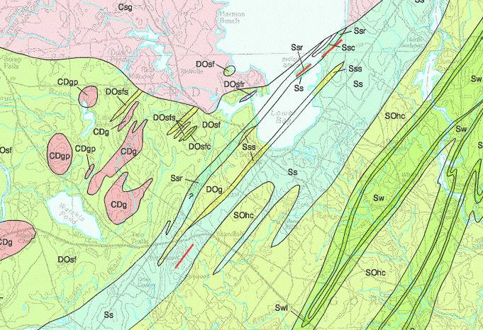
Figure 1a. Section of a 1:100,000 scale bedrock map of the area near Sebago Lake. Note the many small plutons to the southwest of the lake. Also note the width and shape of the small ribbon units in the eastern portion of the image. The contacts on this map have been generalized on the 1:500,000 scale bedrock map shown in Figure 1b.
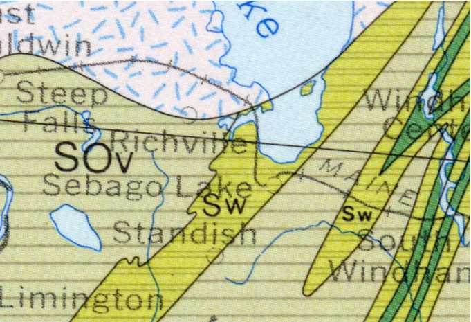
Figure 1b. Section of a 1:500,000 scale bedrock map of the area near Sebago Lake. Note that the many small plutons to the southwest of the lake (seen in Figure 1a) are not shown. Also note the width and shape of the small ribbon units in the eastern portion of the image have been simplified and enlarged as compared to the 1:100,000 scale map shown in Figure 1a.
Figure 2a. Section of a 1:24,000 scale surficial geology map of the area near Cumberland Center. Note the complex pattern of surficial units. Compare this pattern with that shown on the 1:500,000 state surficial geology map (Figure 2b).
Figure 2b. Section of the 1:500,000 scale state surficial geology map showing the area near Cumberland Center. Compare this simplified and generalized pattern with that shown on the 1:24,000 surficial geology map (Figure 2a). Note that many of the smaller units have been eliminated at this scale and the contacts have been smoothed.
All about Data
Where are the data points located?
All geologic maps are based on measurements taken in the field. Nature, however, often gets in the way. For mappers of surficial deposits, vegetation, water bodies, and swamps obscure the underlying materials (Figure 3). The mapper must dig through this vegetation and overlying soil to see what lies beneath. For bedrock mappers, surficial materials cover much of Maine. Only where bedrock pokes through to the surface can measurements be taken (Figure 4). In Maine, there is no program for drilling bedrock cores to determine actual underground relationships. Thus, in areas with little data, contacts must be interpreted based on landforms and interpolation of measurements taken at outcrops. So, simply put, look for the data points on a geologic map -- that's where the accuracy is. Be aware that data used to construct some maps are shown on related map series. For example, much of the data used for surficial geology maps are shown on surficial materials maps.
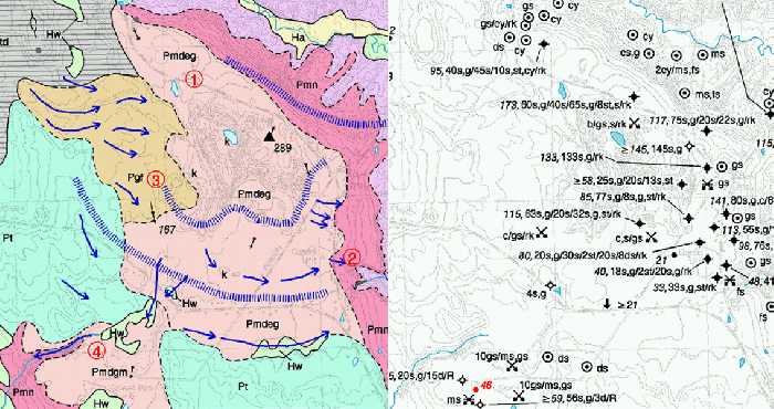
Figure 3. Portion of a surficial geology map (left) and a surficial materials map (right). Note how the data observations on the materials map are clustered around the eastern border of the Pmdeg unit. As a result, the Pmdeg-Pmn boundary is the most accurately located boundary on this part of the map. Other boundaries were interpreted from topography and air photos.
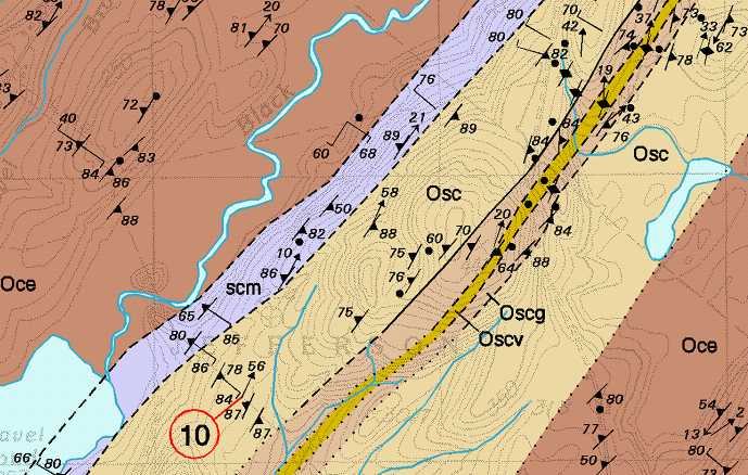
Figure 4. A portion of the Weeks Mills bedrock geology map. First note the pattern of symbols shown on the map. Each symbol shows the location of a measurement taken at a bedrock outcrop. Where there are more symbols, the contacts are more accurate. Note also the solid, dashed, and dotted contacts. Solid lines represent known contacts constrained by multiple outcrops, dashed lines represent approximate contacts determined by fewer measurements, and dotted lines represent inferred contacts where there are no outcrops.
How can you envision the third dimension?
It is an obvious, but important concept to remember that a map only shows the pattern of geologic units at the land surface. A map is a two-dimensional representation of a three-dimensional world. Whether it be surficial materials or bedrock, the various layers extend below the land surface to different depths and in different directions. The lines and colors on the map give you the 2-dimensional pattern of the geology. To understand the 3rd dimension, you must refer to the map symbols, cross sections if available, or maybe even to another map. Bedrock maps often include cross sections (Figure 5) which show a schematic representation of subsurface rock relationships. In the absence of a cross section, the dips and plunges shown by the structure symbols give an indications of subsurface trends to a trained map reader. Subsurface data for surficial geology maps is shown on surficial materials maps in test hole and well logs and descriptions of gravel pits (Figure 6). Correlation of the thicknesses and depths of materials on these maps will give an indication of subsurface trends. Visit GeoBlocks 3D for an interesting visual introduction to subsurface geology.
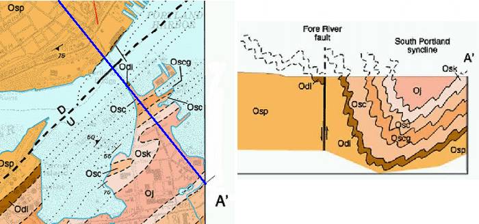
Figure 5. Portion of the Portland West bedrock geology quadrangle. The cross section at right is drawn along the traverse line shown in blue on the map at left. The cross section shows the geologist's schematic interpretation of how the rock layers extend underground.
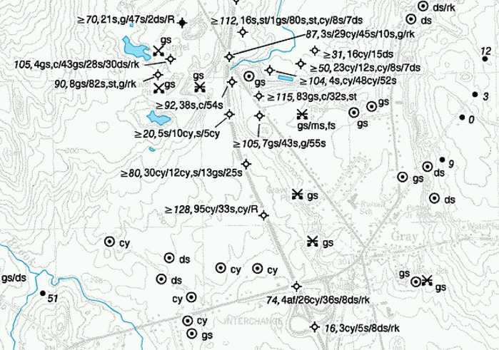
Figure 6. A portion of the surficial materials map of the Gray quadrangle. Subsurface records from observation wells and test borings provide the most detailed information shown on the materials maps. These records are shown as lengthy strings of letters in the figure (refer to reading well logs for more information). At the other extreme, observations at shovel or hand-auger holes only show the type of material at a shallow depth from the land surface. Auger holes are shown by a dot in a circle in the figure, and the material is shown by an abbreviation -- cy for clay for instance. Deposits which may occur under this surface layer are not known. The map user should be aware of this distinction when interpreting the data shown on the map.
A Snapshot in Time
Can the geologic boundaries in an area change?
Over human time scales, the bedrock geology of an area is essentially unchanging (with exceptions for events like volcanic eruptions - not likely in Maine). Surficial geology is generally very slowly changing, again with exceptions for events like major floods or coastal storms which can alter the shapes of rivers or coastal shorelines. But, geologic maps are interpretations of the geology of an area created from observations of the natural landscape. Time constraints, funding, and project focus determine how much information is gathered. The geologist then "connects the dots" to create the map and interpret the data. The resulting map portrays the geologist's interpretation based on the available information at that point in time (Figure 7). Future projects in the same area may uncover new outcrops, produce new seismic lines, or describe recent gravel pits. Due to the collection of this new information, a geologic map may be revisited. The new observations will often refine the geologist's interpretation, the way the dots are connected. Think of a geologic map as an evolving portrait -- it is not static, it can change over time (Figure 8).
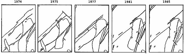
Figure 7. These diagrams show how the interpretation of the geology in the Big Lake quadrangle changed over a span of 10 years. Continuing data collection and field work in the area refined the interpretation of the contacts, causing the portrayal of the shape of the rock boundaries to change over time.
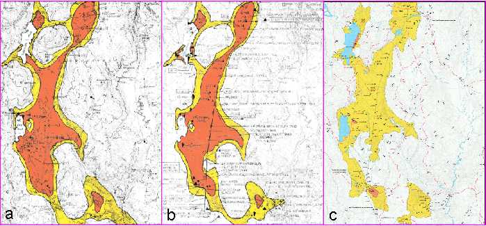
Figure 8. Change in interpretation of aquifer boundaries over time. a. 1979 sand and gravel aquifers map (scale 1:50,000). b. 1985 significant aquifers map (scale 1:50,000). c. Current edition of significant aquifers map, published in 1999 (scale 1:24,000). Note how the interpretation of aquifer boundaries has changed as more data was collected. Note especially how the high-yield (red) areas have shrunk, representing a more conservative estimate of the potential yield of the aquifer. For a more detailed discussion, read Sand and gravel aquifer maps - A work in progress.
What happens when the shape of the land changes?
Geologic maps portray the earth's geology at a specific point in time. Natural and man-made processes may change the shape of the land after the map is made. Erosion, especially in coastal areas, is constantly changing the shape of the land surface. The shape of today's beaches and bluffs may not be the same tomorrow after a storm or a landslide. Gravel operations mining sand and gravel may actually eliminate sections of esker or other glacial features. Keep this in mind when reading a geologic map -- it is a "snapshot in time" which represents the conditions present when the map was made. This is especially true on maps portraying coastal geology and surficial materials.
Do the names of geologic units match between adjacent maps?
Nomenclature describing geologic units evolves over time. Bedrock formations named by geologists 50 or 100 years ago may now have entirely different names. The actual rock described, however, has not changed -- only the name has changed (Figure 9). This often occurs when geologists work in widely separated parts of the state, each naming the rocks in their local area. Over time, the extent of mapping expanded until study areas became adjacent. At this point, it was often recognized that each geologist was calling the same rock by a different name. Recent small-scale compilation maps have attempted to standardize formation nomenclature, but many out-of-date names still exist on older maps. So in reading the map be aware of this possibility and carefully read the rock descriptions in each map explanation.
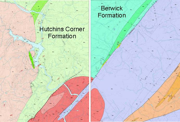
Figure 9. Adjacent sections of the Bar Mills (left) and Old Orchard Beach (right) 7.5-minute bedrock geology maps. The Bar Mills map was published in 1995 and the Old Orchard Beach map in 2003. Note that the rocks identified as the Hutchins Corner Formation on the Bar Mills map are now identified as the Berwick Formation on the Old Orchard Beach quadrangle. The rocks themselves have not changed. However, changing views of regional stratigraphy have caused the rocks to be renamed the Berwick Formation. If the Bar Mills quadrangle was remapped today, the rocks labeled as Hutchins Corner Formation would be named Berwick Formation.
Do geologic boundaries match between adjacent maps?
The interpretation of geologic information evolves over time. New information in surrounding quadrangles may alter map patterns. If you are viewing adjacent quadrangles, look for "border faults" (Figure 10). The discrepancies at map borders represent differences in interpretation between map authors due to new data or date of publication. You may need a geologist to resolve these discrepancies.
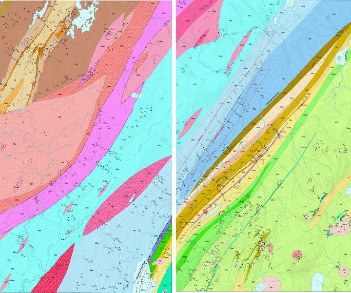
Figure 10. Adjacent sections of the Washington (left) and Searsmont (right) 7.5-minute bedrock geology maps. The Washington quadrangle was published in 2004 and the Searsmont quad is still in preparation. Note that the colors do not match exactly along the quadrangle border. Such a mismatch is known as a "border fault" and indicates a difference in interpretation of the bedrock data in each quadrangle. More field work would need to be done in the area between the quads to solve this sort of problem and create a "seamless" match.
Last updated on October 12, 2012