Documentation for Template v3.0
This documentation is for version 3.0 of the State Agency Template, released in November 2016. This documentation was written for creating static websites using Dreamweaver. Sites that have moved into Drupal have most of the complex backend and styling already created in the Drupal theme. Basic styling and containers are consistent between static websites and Drupal websites.
General
- What's new/different?
- Elements of the new template
- Default colors
- Files included in kit
- Usability
- Accessibility
Layouts
- Layout Overview
- Homepage/One column page
- Two column page with navigation on left side
- Two column page with right side bar (no left nav)
- Three column page
Header
- Where to modify the page header
- How to pick a header color that are accessible
- How to create the header image
- How to add the header image to your site
- How to set up search
Navigation
- What is first, second and third level navigation
- Main navigation
- How to use the template with dropdown menu
- How to use the template without dropdown menu
- How to use tempate without main navigation
- How to add highlighting to the sections (formerly tabs)
- How to create the left navigation
- How to add the left navigation to different pages/sections
- How to add a headline to the left navigation
- Mobile navigation
- How to add the breadcrumb trail
Content
- Section Banner
- How to use pre-styled columns in your content
- Premade buttons
- Premade image size CSS classes
Footer
- Where to modify the page footer
- How to pick a footer color that is accessible
- How to add your agency logo in the footer
- How to add Social Media icons to the footer
Other
Helpful tools/resources (off site)
What's new/different?
Version 3.0 of the agency template is not as "boxy" as previous versions → it has no border around the content.
The layout spans across the entire screen. The header image transitions to a background color which will fill up the entire width of the screen when the browser window is wider than the header background image.
The page footer now has a background color (same as header color) to create a "frame" for the page.
We increased the font size and also changed the fonts for easier reading.
Another major difference is the navigation. Version 3.0 comes with the option of a drop-down menu. It also has a new and improved mobile navigation.
Furthermore, the new template comes with several features such as the DataTables plugin, sample slideshow, show/hide function, premade link buttons as well as highlight boxes.
There are two versions of the template kit. One has the header and footer in the main.dwt file, and the other one inserts the page header and footer via include (header.inc and footer.inc)
Elements of the new template
You can look at the different template elements by dragging the slider to the left and right.
- Citizen Alert - Will show up at the top of every page when a citizen alert is posted to Maine.gov
- Sliver - Gets inserted automatically by the server
- Header - Includes header image, logo, secondary top navigation and search box
- Main Navigation - Can also be used as a drop down menu
- Breadcrumb Trail - Lets users know where on your site they are
- Left Navigation - Secondary navigation that contains subpages of website sections
- Left Navigation Headline - Optional
- Section Header - Optional
- Main Content - Page content
- Right Column - Can be used to highlight information, documents, links etc.
- Footer - Contains your state agency logo, contact information, social media links, etc.
Default colors
The template kit has the following default colors:
#1c213f (Dark Blue): Header, Footer, Main Navigation highlight, Left Navigation headline, Right Column headline
#d9d9d9 (Grey): Main Navigation
#f4f5f7 (Light grey to white gradient): Section Header
#607c05 (Green): Search button
Files included in the kit
Template Files
- main.dwt - Template of your website
- main-with-comments.dwt - contains comments that describe the code
Includes (if you choose the include template version)
- inc/header.inc - Make all header changes in this file
- inc/header-with-comments.inc - Contains comments that describe the code
- inc/footer.inc - Make all footer changes in this file
- inc/footer-with-comments.inc - Contains comments that describe the code
HTML
- index.html - Homepage
- sample/index.html
- sample/one-column.html - Page has no left nav or right column
- sample/twoclumns.html - Page has left nav and main content
- sample/twocolumns-right.html - Page has main content and right column
- sample/three-columns.html - Page has left nav, main content and right column
- sample/bigsmall-columns.html - Main content area has a big and a small content column
- features/index.html
- features/buttons.html - Pre-made link buttons
- features/datatables.html - Sample of DataTables plugin
- features/highlightbox.html - Box with background image and link buttons
- features/showhide.html - Plugin to show/hide content with one click
- features/slideshow.html - Sample slideshow using the Flexslider plugin
CSS
- index.css - Imports all stylesheets (except for sphone.css which is called in the head of the HTML file)
- custom.css - Add all your custom styles to this file
- print.css - Add styles for print version of your website
- sphone.css - Add styles for mobile version of your website
Usability
The design of the template is based on usability research and established web design best practices.
The following features will enhance ease of use:
- Consistent layout, look, and placement of navigation elements
- Search in header is available from every page
- Home link, sitemap link and "Contact Us" link available from every page
- Breadcrumb trail navigation on inner pages indicates user location and provides alternative navigation options
- Navigation systems include clear "you are here" indicators as the user moves deeper into the site.
- Fast download of pages
- Using CSS and HTML5 reduces page load time dramatically
- Greater browser compatibility (the template has been thoroughly tested for browser compatibility)
Things to keep in mind while building your website:
- Links to documents - Let the user know when a link goes to a downloadable file by putting the file format behind the link. (e.g. 2016 Annual Report (PDF).
- External links in navigation - A big NoNo! Your website's navigation (main nav, left nav etc.) is for internal pages only. By adding links to external websites, you confuse the users as they expect to navigate within your website and not leave it.
Accessibility
The template has several built-in features to enhance accessibility to the disabled, including:
- "Skip navigation" links: These "invisible" links allow a blind user with screen reader software to skip over repetitive header and navigation links and move directly to the page's main content. In version 3.0 the skip links have been updated and now users can skip to main navigation, skip to left navigation, skip to content and skip to footer.
- Text navigation: Very few graphics are used in the templates. All navigation is text. This is more accessible than graphical text, since it can be enlarged as needed and is directly readable by screen-reading software. Furthermore, users that cannot use a computer mouse can use their keyboard to tab through all menus on the page. (Including the mobile navigation).
- Site map: A textual site map provides an alternative navigation system and is helpful for some disabled users.
- CSS: Correct use of CSS to separate presentation from content allows users to control the site display to their own preferred settings, and provides a cleaner page that is more accessible to screen reader software, text browsers, and alternative devices.
- Font sizing: Accessibility policy requires that sites use relative font sizing. This means that font sizes are relative to the user's selected base font size and can be enlarged or reduced by the user. We have provided standard font sizing within the style sheets that meets all accessibility requirements and is cross- browser compatible.
- Color contrast: The template comes with default colors (header, footer, text, links, buttons, background, etc.) that meet the accessibility requirements of the WCAG 2.0 color contrast ratio of 4.5:1.
How to make your content more accessible
Every webmaster is responsible to make their website content accessible.
Here are a few things to keep in mind while building your website:
- Alt tag for images - This is especially important if the image is relavant to the content. The alt tag should be a short description of what is on the image so a screen reader can read it to a visually impaired person. If your image is purely for decoration, you can leave the alt tag empty (e.g.
<img src="image path" alt="" />) and the screen reader will skip the image. - No "click here" links - The clickable text of a link should be descriptive and let the user know what to expect when he/she clicks on the link. "Click here" is not descriptive and should never be used as a link text.
- Clean code - Clean code is good code! Make sure to validate every page you build by using an HTML validator (e.g. The W3C Markup Validation Service).
- Color contrast - If you work with color (text and backgrounds), make sure the color contrast ratio meets the accessibility standard of 4.5:1. You can learn more about color contrast and check your colors by using the WebAIM Color Contrast Checker.
More web accessibility resources:
Layout Overview
The new template comes with four layout options. One column, two columns with a left sidebar and content, two columsn with right sidebar and content as well as three columns (left and right sidebars and content area).
Homepage/One column page
In order to create a one column page (the homepage for example), open Dreamweaver and go to "File" → "New" and select the template in the "Site Templates" section. This will create a new page using the new template.
By default it will create a two column page that shows the left navigation and the content area to the right of it.
Take the following steps to turn the page into a one column page:
- Before working on the page, save it.
- Go to "Modify" → "Template Properties". Change the settings to match the image:
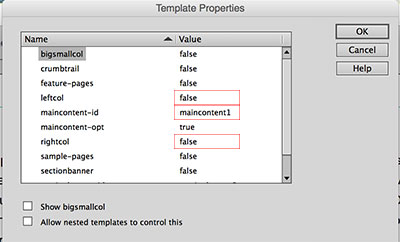
leftcol = false (hides the left column)
maincontent-id = maincontent1
rightcol = false (hides the right column) - Click "OK" and save your page.
Two column page with navigation on left side
The two column page with the left navigation is the default page you create with the template.
In case you want to change the layout of an existing page to this two column layout, use the following steps:
- Go to "Modify" → "Template Properties". Change the settings to match the image:
leftcol = true (shows the left column)
maincontent-id = maincontent2
rightcol = false (hides the right column) - Click "OK" and save your page.
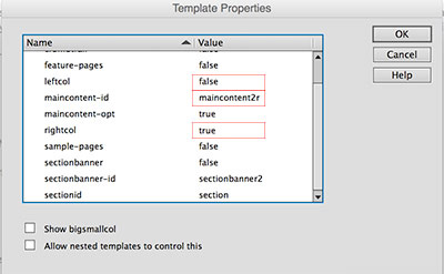
Two column page with right side bar (no left nav)
To only have a column on the right but not on the left, use the following steps and settings:
- Go to "Modify" → "Template Properties". Change the settings to match the image:

leftcol = false (hides the left column)
maincontent-id = maincontent2r
rightcol = true (shows the right column) - Click "OK" and save your page.
Three column page
For a three column page that contains the left navigation, main content area and the right column, use the following steps to set up your page:
- Go to "Modify" → "Template Properties". Change the settings to match the image:
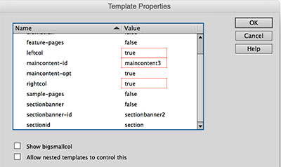
leftcol = true (shows the left column)
maincontent-id = maincontent3
rightcol = true (shows the right column) - Click "OK" and save your page.
Where to modify the page header
Unlike in the previous template versions, in the new template you have the option to insert the page header (and footer) into your website by include (inc/header.inc). The benefit of using the header include is that you don't have to update every single page when you make a change to the header. You only edit the header.inc file and upload it and your updates will show up on every page.
Important: Link paths in the header include need to be absolute.
If you are using the template version that doesn't use header and footer includes, you will have to make header changes in the main.dwt file.
How to pick a header color that is accessible
When choosing a background color for your header (and footer), it is important that the color contrast between the background color and the text color is high enough. You can use the WebAIM Color Contrast Checker to make sure your colors are accessible.
If you decide to use a background image for the header, pick one of its colors to use as a background color which will show in case the image won't load and will also show to the left and right of your header image on a big screen (image fades into the color).
The same background color will be used in the footer.
You can change the header background color by opening custom.css and editing the following code (bold part):
header { color:#fff; background:#1c213f url(../images/header.jpg) no-repeat center 0; }
Depending on your header image and background color, you will also have to change the text color to ensure a high color contrast. You can do this by editing the following code in custom.css (bold part):
header { color:#fff; background:#1c213f url(../images/header.jpg) no-repeat center 0; }
How to create the header image
The dimensions of the header image are 1,300px by 90px.
We recommend saving your header file as header.jpg so you won't have to change the file name in the CSS file. If you decide to name it something different, don't forget to change the file name in custom.css.
How to add the header image to your site
Open custom.css and look for the following code (should be on lines 1 and 2):
header .sub-container { color:#fff; background:#1c213f url(../images/header.jpg) no-repeat center 0; }

header h2.logo a { width:450px; } /* Changes width of clickable home link in header */
In the header styles (line 1) replace the background color with the color you chose for your header (and footer) and replace the image path with the path to your new header image.
On line 2 you have to adjust the width of the clickable home link in the header (see image below).
How to set up search
Open header.inc (located in the inc folder in the template kit) and locate the following code:
<form action="https://www.maine.gov/search" method="get">

<label class="hide-label" for="inlabel">Search Department</label>

<input type="text" size="24" name="search" id="inlabel" class="search_area" placeholder="Search Department/Agency">

<input class="search_button green_btn" type="submit" value="Search">

<input type="hidden" value="www.maine.gov/AGENCYNAME" name="as_sitesearch">

</form>
First, add your Agency name to the form label and the placeholder where it says "Search Department/Agency" (e.g. Search DACF).
Then find the input field with the URL http://www.maine.gov/AGENCYNAME and change AGENCYNAME to the name of your website directory (e.g. http://www.maine.gov/dacf).
The site search will only work on the production server, not on the development server.
What is first, second and third level navigation
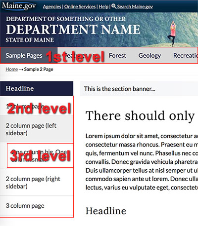
If you are using a drop down navigation in your website, the second level links will also show in the drop down.
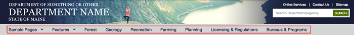
Main Navigation
When setting up your main navigation, make sure that it is not wider than the sample navigation in the template kit. If the navigation is too wide, the menu items will wrap when the browser window is resized, which breaks your layout.
If some of your navigation titles are very long, you can wrap them into two lines like this:

In order to make the rest of the navigation look right, you then have to vertically center the one lined titles. You can do this by locating the following code in your custom.css file and replacing the bolded code with the class names of the single lined items (if you're using the default class names):
nav .samplestab, nav .featurestab, nav .tab3, nav .tab4, nav .tab5, nav .tab6, nav .tab7 { display:inline-block; vertical-align:middle; line-height:40px; }
Remove the class names of all the two lined navigation titles since they don't have to be vertically aligned.
Important: If you do NOT have any two lined navigation items, remove the entire style or else the navigation will not look correct.
How to use the template with dropdown menu
Note: The dropdowns are not intended to replace the left navigation because the left navigation is used for mobile navigation.
The main navigation is created by using an unordered list (<ul></ul>). In order to add a drop down to the navigation, you simply have to add nested lists to each main menu item.
Sample
- About
- subpage 1
- subpage 2
- subpage 3
- Programs
- subpage 1
- subpage 2
- subpage 3
- News
HTML
<nav aria-label="Main menu" role="navigation" class="megamenu">

 <div class="sub-container clearfix">

  <ul class="sf-menu" id="dropdown">

    <li><a href="">About</a>

      <ul>

       <li><a href="">subpage 1</a></li>

       <li><a href="">subpage 2</a></li>

       <li><a href="">subpage 3</a></li>

      </ul>

     </li>

     <li><a href="">Programs</a>

      <ul>

       <li><a href="">subpage 1</a></li>

       <li><a href="">subpage 2</a></li>

       <li><a href="">subpage 3</a></li>

      </ul>

    </li>

    <li><a href="">News</a></li>

  </ul>

 </div>

</nav>
CSS
To change the colors of the main navigation, open custom.css, locate the following code and adjust the bolded values:
/* Main (drop down) navigation colors */

nav#top-nav, nav#top-nav ul.sf-menu, .sf-menu li { background-color: #D9D9D9; }

.sf-menu li:hover, .sf-menu li.sfHover { background:#1c213f; color:#fff; }

.sf-menu a, .sf-menu a:link { color:#1c213f; }

.sf-menu li:hover { color:#fff; }

.sf-menu li ul li a { color:#1c213f; }

.sf-menu a:hover, .sf-menu li.current a:hover, .sf-menu li.current, ul.sf-menu li:hover > a, .sf-menu li a:focus, .sf-menu li.sfHover .sf-with-ul { color:#fff; }

.sf-menu ul { border-top:5px solid #1c213f; }

.sf-menu ul li { background:#fff; border-bottom:1px solid #f1f1f1; }


/* Dropdown navigation default arrow color - border-top-color only should be same color as links */

.sf-arrows .sf-with-ul::after, .sf-arrows .sf-with-ul:after { /* do not change this -->*/ border:5px solid transparent; /* only change this -->*/ border-top-color:#1c213f; }


/* Dropdown navigation arrow color when mouse hovers - should be same color as the text when hovered */

.sf-arrows > li > .sf-with-ul:focus::after, .sf-arrows > li:hover > .sf-with-ul::after, .sf-arrows > .sfHover > .sf-with-ul::after { border-top-color:#fff; }
How to use the template without dropdown menu
If you do not wish to use dropdowns in your main menu, don't add nested list items. The navigation should have one level only:
- About
- Programs
- News
<nav aria-label="Main menu" role="navigation" class="megamenu">

 <div class="sub-container clearfix">

  <ul class="sf-menu" id="dropdown">

   <li><a href="">About</a></li>

   <li><a href="">Programs</a></li>

   <li><a href="">News</a></li>

  </ul>

 </div>

</nav>
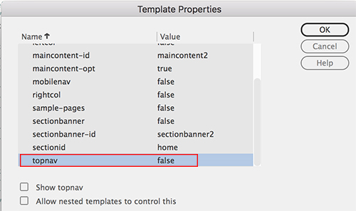
How to use the template without main navigation
If you don't want to use a top navigation on your website, you can turn it off or hide it (depending on whether you use the template with or without header/footer includes).
If you are using the template with includes, you can hide the main navigation by commenting it out. In the header.inc file look for:
<nav id="top-nav" aria-label="Main menu" role="navigation" class="megamenu">
and comment out everything within the <nav> and </nav> including the <nav> tags. Comment tags are: <!-- commented out code goes here -->
If you are using the template without includes, all you have to do is set the the topnav to false in the template properties.
How to add highlighting to the sections (formerly tabs)

There are three steps to make the highlighting of the main navigation work:
- Give each main navigation item an unique class name
- Add the class names of the navigation items and the IDs of the different sections to your custom.css file
- Enter the section ID in the template properties
Step 1
The following code is the sample navigation in the agency template (including the subpages that show up in the dropdown). The bolded code are our sample class names. You can use your own class names or use "tab1", "tab2", etc.
<nav id="top-nav" aria-label="Main menu" role="navigation" class="megamenu">  <div class="sub-container clearfix">

  <ul class="sf-menu" id="dropdown">

   <li><a href="/agencytemplate3/sample/index.html" class="samplestab">Sample Pages</a>

    <ul>

     <li><a href="/agencytemplate3/sample/one-column.html">1 column page</a></li>

     <li><a href="/agencytemplate3/sample/two-columns.html">2 column page (left sidebar)</a></li>

     <li><a href="/agencytemplate3/sample/two-columns-right.html">2 column page (right sidebar)</a></li>

     <li><a href="/agencytemplate3/sample/three-columns.html">3 column page</a></li>

    </ul>

   </li>

   <li><a href="/agencytemplate3/features/index.html" class="featurestab">Features</a>

    <ul>

     <li><a href="/agencytemplate3/features/datatables.html">DataTables</a></li>

     <li><a href="/agencytemplate3/features/slideshow.html">Slideshow</a></li>

     <li><a href="/agencytemplate3/features/buttons.html">Buttons</a></li>

     <li><a href="/agencytemplate3/features/showhide.html">Show/Hide</a></li>

     <li><a href="/agencytemplate3/features/highlightbox.html">Highlight Box</a></li>

    </ul>

   </li>

   <li><a href="/agencytemplate3/index.html" class="tab3">Forest</a></li>

   <li><a href="/agencytemplate3/index.html" class="tab4">Geology</a></li>

   <li><a href="/agencytemplate3/index.html" class="tab5">Recreation</a></li>

   <li><a href="/agencytemplate3/index.html" class="tab6">Farming</a></li>

   <li><a href="/agencytemplate3/index.html" class="tab7">Planning</a></li>

   <li><a href="/agencytemplate3/index.html" class="tab8">Licensing & Regulations</a></li>

   <li><a href="/agencytemplate3/index.html" class="tab9">Bureaus & Programs</a></li>

  </ul>

 </div>

</nav>
Step 2
Open custom.css and locate the following code (should be on line 32):
body#samples nav .samplestab, body#features nav .featurestab, body#tab3 nav .tab3tab, body#tab4 nav .tab4tab, body#tab5 nav .tab5tab, body#tab6 nav .tab6tab, body#tab7 nav .tab7tab, body#tab8 nav .tab8tab, body#tab9 nav .tab9tab { background-color:#4e5668; color:#fff; }
If you decide not to use the sample classes, you can remove them all. In order to use your own custom classes, you'll have to add the following:
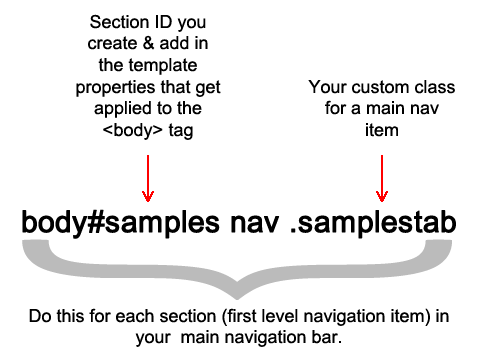
Example
If your first navigation item is "About Us" you could give it the class of abouttab and use the section ID of about. You'd have to add the following code in custom.css:
body#about nav .abouttab
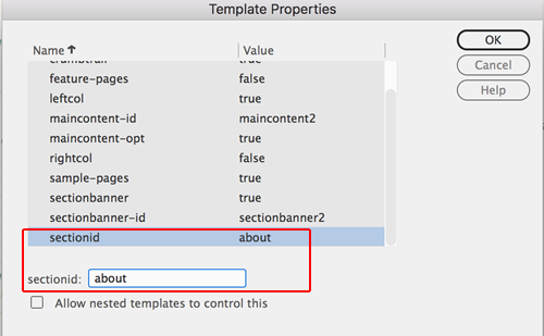
Step 3
For every page you create in a section (e.g. the About Us section), you have to change the section ID to "about" in the template properties:
How to create the left navigation
Open the template file (main.dwt) and look for the following code:
<!-- TemplateBeginIf cond="leftcol" -->

<nav id="sectionnav" role="navigation">
The left navigation for every section has to be placed between
<!-- TemplateBeginIf cond="leftcol" -->

<nav id="sectionnav" role="navigation">
and
</nav>

<!-- TemplateEndIf --><!-- end leftcol -->
For each section of your website that has a left navigation, create the following code block:
<ul class="mainnav">

 <li><a href="linktopagegoeshere">First subpage title</a></li>

 <li><a href="linktopagegoeshere">Second subpage title</a></li>

 <li><a href="linktopagegoeshere">Third subpage title</a></li>

 <li><a href="linktopagegoeshere">Fourth subpage titl</a></li>

</ul>
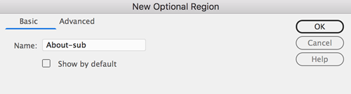
Next, highlight the entire code block including <ul> and </ul>. Then go to Insert → Template → Optional Region and name your optional region (e.g. for the left nav in the About Us section it could be "About-sub"). Make sure to uncheck the "Show by default" checkbox.
Repeat this process for every left navigation in your site. For example, if you have 6 items in your main navigation bar, your site might have 6 left navigations (one per section, if every section has subpages).
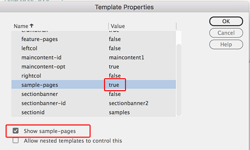
How to add the left navigation to different pages/sections
Once you created the left navigation for every section of your website, you can add them to your pages by opening a page and then going to Modify → Template Properties. Find the name of the left navigation you'd like to display on that page. Set it to "true" by checking the "Show ..." checkbox (see image below). Click "OK" and save your page.
How to add a headline to the left navigation
To add a headline to the left navigation, add <h3></h3> between the opening <div> and the opening <ul> tags like in the code sample below:
<div id="sectionnav" class="subsection nav" role="navigation">

 <h3>Headline</h3>

<ul class="mainnav">
You can adjust the colors of the headline in the custom.css file. Locate the following code and change the bolded values:
#sectionnav h3 { background-color:#1c213f; color:#fff; }
Mobile navigation
The mobile navigation is the same as the left navigation (#sectionnav) but without the sub-navigation template parameters.
Changes you make to your left navigation also have to be made to the mobile navigation. Important: The bolded code may not be changed, it's needed for the mobile navigation to work correctly.
<nav id="mobilenav" role="navigation">

 <ul id="mobilemenu" class="sm sm-simple">

  <li>

   <h2><a href="index.html">Menu</a></h2>

   <!-- TemplateBeginIf cond="_document['sample-pages']" -->

   <ul class="mainnav">

    <li><a href="/agencytemplate3/sample/one-column.html">1 column page</a></li>

    <li><a href="/agencytemplate3/sample/two-columns.html">2 column page (left sidebar)</a>

     <ul>

      <li><a href="/agencytemplate3/sample/bigsmall-columns.html">One column big, One column small</a></li>

     </ul>

    </li>

    <li><a href="/agencytemplate3/sample/two-columns-right.html">2 column page (right sidebar)</a></li>

    <li><a href="/agencytemplate3/sample/three-columns.html">3 column page</a></li>

   </ul>

   <!-- TemplateEndIf --><!-- end sample pages navigation -->

   <!-- TemplateBeginIf cond="_document['feature-pages']" -->

   <ul class="mainnav">

    <li><a href="/agencytemplate3/features/datatables.html">DataTables</a></li>

    <li><a href="/agencytemplate3/features/slideshow.html">Slideshow</a></li>

    <li><a href="/agencytemplate3/features/buttons.html">Buttons</a></li>

    <li><a href="/agencytemplate3/features/showhide.html">Show/Hide</a></li>

    <li><a href="/agencytemplate3/features/highlightbox.html">Highlight Box</a></li>

   </ul>

   <!-- TemplateEndIf --><!-- end features pages navigation -->

  </li>

 </ul>
</nav>
How to add/remove the breadcrumb trail
The breadcrumb trail navigation must be used on all inner pages of your site. This provides users a clear indication of their current location within the hierarchy of your site, as well as an alternative navigation system. This is an important usability feature of the standard design and the code is included in the template.
The breadcrumb trail is enabled by default. If you want to add or remove it from a page, use the following steps:
- Go to "Modify" → "Template Properties". Change the settings to match the image:
crumbtrailsettings.jpg
crumbtrail = true (shows the crumbtrail) - Click "OK" and save your page.
The breadcrumb trail will need to be edited on each page of your site. It always begins with the Home page link. On second level pages of your site, it will consist of the Home link followed by the current page name.
Pages must be separated by the arrow charachter (→) character (which in Code View will look like →). For example, Home → About Us. On second level pages it would continue, for example, Home → About Us → Staff. A third level page might look like Home → About Us → Staff → Main Office. The last item in the trail is always the name of the current page and is not a link. All preceding pages in the trail function as links to their respective pages.
Code sample
<div class="crumb_trail">
<p><a href="../index.shtml">Home</a> →
<!-- TemplateBeginEditable name="breadcrumbs" -->
<a href="#">Sample Section </a> → <a href="#">Sample Link 1 </a> → Sample Link 1.2
<!-- TemplateEndEditable -->
</p>
</div>
Section Banner
If your agency website would like to maintain one header but call out individual sub agencies, the section banner is a good way to acheive this.
<!-- TemplateParam name="sectionbanner" type="boolean" value="false" -->
How to add a Section Banner to a 1, 2 (left or right column) and 3 column layouts
With the page you would like to add the section banner to open, click on the Modify > Template Properties.. in the top menu. To add the section banner to the page, adjust the Template Properties in the following way.
For 1 column (main content area only) layouts set the properties as follows:
Name/Valuemaincontent-id: maincontent1
sectionbanner: true
sectionbanner-id: sectionbanner1
For 2 column (left column and main content area) layouts set the properties as follows:
Name/Valuemaincontent-id: maincontent2
sectionbanner: true
sectionbanner-id: sectionbanner2
For 2 column (main content area and right column) layouts set the properties as follows:
Name/Valuemaincontent-id: maincontent2r
sectionbanner: true
sectionbanner-id: sectionbanner2r
For 3 column (left column, main content area and right column) layouts set the properties as follows:
Name/Valuemaincontent-id: maincontent3
sectionbanner: true
sectionbanner-id: sectionbanner3
How to use pre-styled columns in your content
For the convenience of the webmasters, the template has pre-styled columns for the content area. This is not to be confused with the layout columns of the template (left nav, content and right sidebar)!
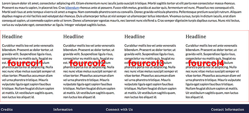
If you want the main content on your page to be split into two, three or four columns, wrap it in <div></div> tags and give each one a class (see list below).
For example, for two columns, you'd have two divs and the first one would have the class of "twocol1" and the second one would have the class of "twocol2".
CSS Classes
Use the following classes for your columns:
- Two columns: .twocol1 and .twocol2
- Three columns: .threecol1, .threecol2 and .threecol3
- Four columns: .fourcol1, .fourcol2, .fourcol3 and .fourcol4
HTML
<div class="threecol1">Content goes here.</div>
<div class="threecol2">Content goes here.</div>
<div class="threecol3">Content goes here.</div>
Example
This content has 4 columns:
Bonus layout
If you'd like to have two content columns with one bigger and one smaller column, you can use the following code:
<div class="twocol1big"></div>

<div class="twocol2small"></div>
Premade buttons
premadebuttons.jpg
In the /features folder of the template kit you can find the buttons.html file that contains several premade link buttons in 8 different colors. The buttons come in different variations: Rectangle or rounded corners as well as solid or outlined.
In order to use the buttons on your website, copy the HTML code (e.g.: <a class="button teal" href="#">Link text goes here</a>) of your preferred button on the features page, paste it into your web page and replace the placeholder text with your link text.
If you wish to use a color that isn't included in the sample buttons, you can create your own color class in the custom.css file. For example, to create a purple button, you would use the following code:
HTML
<a class="button purple" href="#">Link text</a>
CSS
.purple.button, .purple.button:visited, .purple.roundbutton, .purple.roundbutton:visited { background-color:#4c2680; color:#fff!important; } ← this (hover) background color needs to be a little darker than the button color you chose.
.purple.button:hover, .purple.roundbutton:hover { background-color:#381c5f; }.purpleoutline.button, .purpleoutline.roundbutton { background-color:#fff; color:#4c2680; border:1px solid #4c2680; text-shadow:none!important; font-weight:500!important; }
a.purpleoutline.button:hover, a.purpleoutline.roundbutton:hover { background-color:#4c2680; color:#fff!important; }
.purpleoutline.button:visited, .purpleoutline.roundbutton:visited { color:#4c2680!important; }
Result
Important: When you create a button using a cusom color (different than the default colors), rename your class to your color. Also, make sure the color contrast ratio meets the accessibility standard of 4.5:1. (Color Contrast Checker)
Premade image size CSS classes
The template comes with several premade classes you can use to position your images in the content area, if you don't want to create your own styles.
You can find the following styles in the styles.css file:
.pic350,.pic325,.pic300,.pic275,.pic250,.pic225,.pic200,.pic175,.pic125 { margin:.5em 0 .5em .5em; float:right; }

.pic350 { width:350px; }

.pic325 { width:325px; }

.pic300 { width:300px; }

.pic275 { width:275px; }

.pic250 { width:250px; }

.pic225 { width:225px; }

.pic200 { width:200px; }

.pic175 { width:175px; }

.pic125 { width:125px; }
If you have an image that is 300px wide and you want to align it to the right in your content, wrap a <div></div> around it with the class of .pic300.
Example:
<div class="pic300><img src="pathtotheimage" alt="" /></div>
Important: In order to prevent slow loading of the page, the image has to be resized using an image editing software. Do not use the height and width HTML tags to resize your large image.
In order to add an image caption to your picture, simply add a paragraph (<p></p>) after the image and add the caption text.
Example:
<div class="pic300><img src="pathtotheimage" alt="" /><p>This is the caption.</p></div>
Where to modify the page footer
Unlike in the previous template versions, in the new template you have the option to insert the page footer (and header) into your website by include (inc/footer.inc). The benefit of using the footer include is that you don't have to update every single page when you make a change to the footer. You only edit the footer.inc file and upload it and your updates will show up on every page.
If you use the template version that doesn't use header and footer includes, you will have to make footer changes in the main.dwt file.
How to pick a footer color that is accessible
See How to pick a header color that is accessible.
To change the footer background color, open custom.css and edit the following code (bold part ):
footer { background:#1c213f; color:#fff; }
Depending on the footer background color, you will also have to change the text color to ensure a high contrast. You can do this by editing the following code in custom.css (bold part):
footer { background:#1c213f; color:#fff; }

footer h4 { color:#fff; }
How to add your agency logo in the footer
footerlogoscreenshot.jpg
In this new template version, the new website footer does not contain the InforME logo in the credit column. It has a placeholder image that you can replace with your agency's logo or name. If InforME builds your agency's website, we will place the InforME logo in the footer.
In order to replace the placeholder image, open the footer.inc file in the /inc folder of the template kit and locate the following code:
<img alt="Your alt text here" src="/agencytemplate3/images/logo-placeholder.png">
Replace the image path so it points to your logo and add the appropriate alt text.
How to add Social Media icons to the footer
socialmediasample.jpg
The following default social media icons are available for you to add to your website's footer:
- Facebook → use class
.facebook - Twitter →
.twitter - LinkedIn →
.linkedin - Blog →
.blog - Youtube →
.youtube - Instagram →
.instagram - Flickr →
.flickr - GovDelivery →
.govdelivery
The <ul> needs a class of .social-media and the social media classes (above) have to be added to the different <li> items.
Example:
<ul class="social-media">

 <li class="facebook"><a href="#">Find us on Facebook</a></li>

 <li class="twitter"><a href="#">Follow us on Twitter</a></li>

 <li class="instagram"><a href="#">Instagram</a></li>

 <li class="govdelivery"><a href="#">GovDelivery</a></li>

</ul>
Sliver
The standard Maine.gov sliver header is automatically attached to the top of all pages hosted by Maine.gov. The header is applied by the server when your pages are viewed in a browser. You do not need to add the header code to your pages, and you will not see the state header when editing your pages locally. The standard design was built to accommodate the addition of the State Header.
The sliver is inserted at the location of the following HTML code:
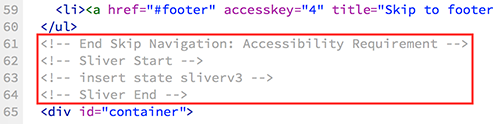
It is extremely important that this code not be removed!
Citizen Alert
A Citizen Alert that is being posted on Maine.gov will show up at the very top of your website.
Mobile Style Sheet
Sphone.css delivers an enhanced website experience for users on mobile devices. This file comes with default mobile styles but must be customized to ensure that it works properly and integrates any custom CSS that has been added.
Website elements that should be re-formated
- Change header background image to background color
- Hide slideshow
- Give images a percentage width and center them
Print Style Sheet
A print stylesheet lets you control how your website looks when printed on paper. Without a print stylesheet, your website might look broken when printed.
Print.css contains style overrides that ensure the cleanest possible print output of your page. The stylesheet hides most of the header and navigation information from the page.
Its purpose is to only print the page content and to save on ink (by hiding big images for example).
If you have images or other elements on your website that you don't want to be printed, simply hide them by applying the style { display:none; } to them.